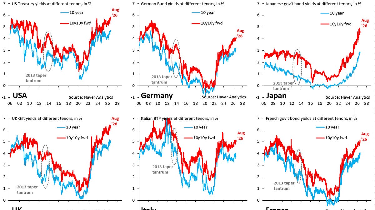

Thank you for subscribing to my posts. If you’re not yet a paying supporter, please consider becoming one. That’ll allow you to DM me with questions and comments. Your contribution will help cover the cost of the data I use in my posts, which I fund out of my own pocket. Thanks so much for your support and feedback! There’s no straightforward way to tell when a country is about to have a debt crisis , especially in this day and age when central banks around the world have fallen into the unfortunate habit of artificially capping government bond yields, which means you don’t get a clean signal from markets anymore on how bad things really are. But stress is clearly building as the past week shows. We had dovish inflation prints out of the US that caused markets to scale back their expectations for Fed hikes. That should have pulled down long-term government bond yields – because it makes it less likely we’re heading for another tightening cycle like in 2022 – but the opposite is true. Long-term yields rose globally and very sharply in some cases. That’s a really worrying sign because it means markets are beyond rewarding the usual “good news.” Today’s post looks at the shape of the yield curve as one indicator for where fiscal distress is greatest. In particular, I look at where the long end has steepened the most relative to history, which could be markets pricing a growing risk premium to reflect rising odds of a debt crisis. Japan stands out – by a large margin – as having the most dysfunctional yield curve, in line with all my work on how long-term yields in Japan are heavily manipulated and “shadow yields” are a lot higher. Artificially low yields are why there’s constant depreciation pressure on the Yen, which is also why intervention can’t possibly hope to stabilize the currency. Japan’s yield caps mean that what would be a debt crisis has morphed into a currency crisis. The underlying issue – too much debt – is the same. The charts above show long-term government bond yields for the US (top left), Germany (top middle), Japan (top right), the UK (bottom left), Italy (bottom middle) and France (bottom right). The blue line is the 10-year government bond yield, while the red line is the 10y10y forward yield, which is what markets price for the 10-year yield in 10 years’ time. I back this out from 10- and 20-year yields. The advantage of the 10y10y forward yield is that – unlike the 10-year yield – it’s less influenced by short-term considerations like whether a central bank is going to hike or not. It thus gives a cleaner read on what markets really think about debt. The remarkable thing about the past week is that – as the charts above show – 10y10y forward yields rose pretty much across the board even though we had dovish data out of the US. The biggest rise was for France, where it rose 14 basis points, followed by the UK (up 13 basis points), Japan (11 basis points) and Italy (10 basis points). The US – which is usually the cleanest shirt in the laundry basket – was up five basis points. The blue lines in the charts above are my proxy for how “broken” yield curves are at the long end. This is the difference between the 10y10y forward and 10-year yield. I demean this difference and divide it by its historical standard deviation. The resulting z-score measures how unusual the slope of the yield curve is at the long end relative to history. The black line in each chart is the median across all G10 z-scores. The gray shaded area is a two standard deviation confidence interval around the black line. If you’re outside this area, something very worrying is going on. Japan sticks out like a sore thumb on this metric. The slope at the long end of its yield curve went crazy after the global hiking cycle in 2022, which made it too costly to keep capping long-term yields as forcefully as before. Japan’s z-score has oscillated near two in recent years, which means the steepening at the long end of its curve is very unusual by historical standards and statistically significant. That’s consistent with my view that Japan’s “shadow yield” is a lot higher than observed yields, which means Japan is – de facto – in a debt crisis . The rest of the G10 don’t look nearly as alarming as Japan, which is consistent with central bank manipulation of bond markets not being quite as egregious. But that’s no signal all is well. Quite the opposite. In the end, what matters for debt sustainability is the level of government bond yields, especially out through the 10-year segment of the curve, and that’s clearly rising everywhere. Japan is just way worse.Read More

Where is the Global Debt Crisis Most Acute?